What is a Pump and Dump, and How You Can Spot a Hot Penny Stock that Is Prime for Bursting
What is a pump and dump stock, and why you should likely avoid them at all costs. A pump and dump is it kind of stock scheme that is usually done with low class penny stocks, investors will seek out charts, that look like they have patterns resembling a pump and dump. A pump and dump is essentially want to trade or looks at a low value piece of crap penny stock, and says I think I can pump this up, before dumping it, taking the profit and getting out quickly. They usually do this by promoting themselves on forearms, by blasting out emails to their users, by storing of traction on their website, and the like. In this blog post, I’ll answer the question of what a Pump and Dump penny stock actually is, and I’ll walk you through how you can spot chart patterns that
| Related Posts |
|---|
More on Pump and Dump Stocks, And How to either Target or Avoid These Stocks Depending on Your Goals
I actually used to trade pump and dump penny stocks, and actually made almost 5 times my money overnight once, before waking up too late, forgetting to sell out of my shares, missing out on the position, and watching as the stock went from $.13, down to a penny. To put this into perspective, I had bought some piece of crap stock, that looked like a pump and dump, and as I looked at the chart pattern, it 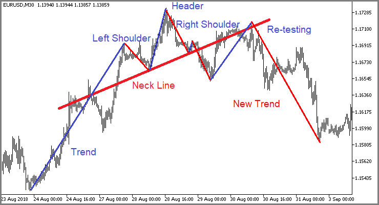 made sense to me that it was likely on the rise. The stock is gone from $.02-$.04 cents over a couple of days, so I placed my order, worth over $1000 on the stock, which was my entire portfolio position at the time (bear in mind I was 18 and had a LOT of learning to do to say the least) on the stock, buying a four cents. Immediately after I bought the stock, it started the truck up words, overnight the stock went from $.04-$.17, before falling, down to one penny, later that afternoon.
When I was young, and when I was 18 I used to stay up relatively late to 3 o’clock in the morning, and in this case I kept clicking and refreshing, watching my stock rise, thinking I could hit it at the peak. I think when I went to Bet it was somewhere around seven or eight cents, or being the lazy 18-year-old I was, I fell asleep until noon, only to look at my stock positions, and see that my now $1000 value portfolio, was worth a mere 250 bucks, and that the chart head Pete around six or 7 o’clock in the morning, heading $.13 a share. How do I woken up early like I had intended to, I would’ve made out like a king and triple the value of my portfolio, had I stayed up a little later, I would’ve likely double the value of my portfolio, instead I screwed up, missed the trade, and lost nearly $1000. And that folks, is my story of why I no longer trade penny stocks.
What Pump and Dump Stock Charts Look Like, and Why This Is Only Done With Penny Stocks
Typically, a pump and dump stock pattern is going to start off very much like a head and shoulders pattern, with a couple of spikes and dips which lead to the start of what sort of looks like a man shrugging his shoulders. From here however, the head of the pattern becomes longer and longer, until you’re left with nothing but a giant spike. I actually traded one of these patterns in the past, and nearly made seven times my money before the whole thing went to zero. I actually had slept past my alarm, and at 6am, the stock had gone from $.02, where I had bought about $1,000 worth of the stock, up to $0.13 per share, of which I would’ve had a 650% gain, or a $5500 profit on a $1,000 investment, for nearly 6 times my money overnight! Instead however, I overslept, and watched as the stock went from 2 cents, up to 13 cents, and down to 0 cents within a few hours. Call it dumb luck, call it fate, I call it a blend of poor discipline, still being in high school, and having no trading experienced (an experienced trader would’ve known to implement a sell limit order at something like 6 or 7 cents a share), or at least would’ve gotten up on time!
Other Major Technical Analysis Patterns, The Head an Shoulder’s Pattern, and The Firm Foundation Theory
Some other majorly popular technical analysis factors, and some of my overall favorites, include my top ten favorites below:
The Head and Shoulders Pattern
The Super Bowl Indicator
The Firm Foundation Theory
 The Castle in The Air Theory
The Odd Lott Theory
Short Interest
The 50 Day Moving Average
The 200 Day Moving Average
The 100 Day Moving Average
Breadth of the Market
And a bunch more, subscribe for additional information!
Final Thoughts on Pump and Dumps, Shorting them, Longing Them, Avoiding Them, and Making Money on Them
To wrap up this blog post, I absolutely would not recommend trading penny stocks, or trying to time pump and dump patterns, as although you might get lucky once in a great while, you really are much better off in an index fund over the long term. With something like an 8-10% annualized return in the S and P 500 (actually that’s a non inflation-adjusted return over the past 100 years or so, and that trend is not likely to continue, with something around 5-6% being a more likely premium in the future), you’re crazy to give up 2x spending power every 7 years just by holding the market portfolio! Be wise, diversify and save yourself fees, taxes, time and transactions costs. Until next time, you heard it first right here at Inflation Hedging.com.
Cheers!
Sources:
https://www.bankrate.com/banking/cds/cd-rates/
https://money.cnn.com/data/markets/
Disclaimer: The opinions and documentation contained within this article and on this blog are the sole property of inflationhedging.com and are not to be copyrighted or reproduced in any manner, else legal action within the rights of the United States legal code could be use to obtain recompense. All articles and blog posts are the sole opinions of the writers of the blog, and are not necessarily in line with what exactly will work for you, you should consult a CPA, Tax Professional, or Financial Professional to determine what exact financial needs are in line with your interests. Also, from time to time, certain links on this website will be used to generate affiliate commissions, in order to support the health and growth of our website, health and business.


[…] and thus carry a much larger expense ratio then the average ETF of .44%. For example, the ETF BIZD carries a 9.62% expense ratio. This means for every $100 that you invest you won’t be paying […]
Thank you very much for this better explanation about the topic. This is really helpful and praiseworthy. I appreciate your thoughts and ideas. Great job.